How Colour Influences Us
by Faryal Ahmad
7/24/2026
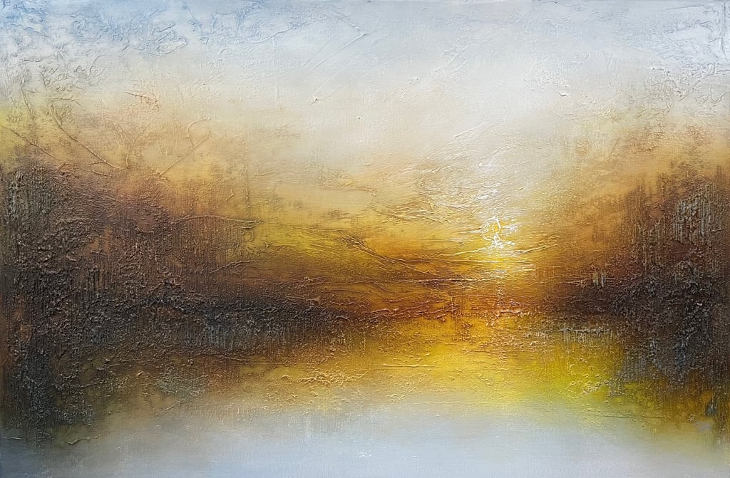
The Psychology of Colour in Art: How Colours Influence Emotion and Meaning.
Colour is one of the most powerful elements of art. Before we notice the details of a painting or understand its subject, we often respond instinctively to its colours. A bright yellow canvas may evoke feelings of happiness and optimism, while a dark blue landscape might create a sense of calm or melancholy. Artists have long understood that colour is more than a visual feature—it is a language capable of communicating emotions, ideas, and stories without words.
The psychology of colour explores how different hues influence human thoughts, feelings, and behaviours. While personal experiences and cultural backgrounds shape how individuals interpret colours, many colour associations are widely recognised and have been used by artists for centuries to create emotional impact.
Why Colour Matters in Art.
Imagine viewing a painting in black and white. Although the composition and subject remain the same, much of its emotional power may be lost. Colour adds depth, atmosphere, and meaning to a work of art. It can guide the viewer's attention, establish mood, symbolise ideas and create visual harmony.
Artists carefully select colour palettes to achieve specific effects. A warm, vibrant composition may communicate excitement and energy, while muted tones can evoke nostalgia, mystery, or tranquility. Through colour, artists influence not only what viewers see but also how they feel.
Warm Colours: Energy, Passion, and Excitement.
Warm colours—red, orange, and yellow—are often associated with energy, warmth, and movement. These colours naturally attract attention and create a sense of activity.
Red: Passion, Power, and Emotion.
Red is one of the most emotionally intense colours. It is commonly associated with love, courage, strength, and passion, but it can also symbolise danger, anger, or conflict. Because it is highly visible, artists frequently use red to draw attention to important subjects within a painting.
Throughout history, red has been used in religious art to represent sacrifice, in political art to symbolise revolution, and in contemporary works to express strong emotions.
Orange: Creativity and Enthusiasm.
Orange combines the energy of red with the optimism of yellow. It often represents creativity, enthusiasm, adventure, and warmth. Artists use orange to create lively, welcoming compositions that feel energetic without being overwhelming.
Because it is less aggressive than red, orange often appears in artworks celebrating movement, festivals, or autumn landscapes.
Yellow: Joy and Optimism.
Yellow is commonly linked to sunshine, happiness, hope, and intellectual curiosity. Bright yellow can make a painting feel cheerful and energetic, while softer shades create warmth and comfort.
However, yellow can also convey caution or anxiety depending on the context and surrounding colours. Artists often use yellow strategically to highlight focal points or create contrast within a composition.
Cool Colours: Calm, Reflection, and Stability.
Cool colours—blue, green, and purple—generally create feelings of peace, balance, and contemplation. They are often used in landscapes, seascapes, and abstract works designed to encourage relaxation or introspection.
Blue: Peace, Trust, and Melancholy.
Blue is one of the world's most popular colours and carries a wide range of emotional meanings. It is frequently associated with calmness, wisdom, loyalty, and stability. Many artists use blue to create peaceful atmospheres or to suggest vast skies and oceans.
At the same time, darker shades of blue can evoke loneliness, sadness, or mystery. This emotional flexibility makes blue one of the most expressive colours in art.
Green: Nature, Growth, and Balance.
Green symbolises life, renewal, health, and harmony. Because it is strongly connected to nature, green often creates a sense of freshness and tranquility.
Artists use green to represent forests, gardens, and fertile landscapes, but it can also symbolise prosperity, environmental awareness, or personal growth.
Purple: Imagination and Luxury.
Historically, purple was associated with royalty and wealth because purple dyes were rare and expensive. Today, it often represents creativity, spirituality, mystery, and imagination.
Artists frequently use purple to add a sense of elegance or dreamlike beauty, particularly in fantasy, symbolic, or surreal artworks.
Neutral Colours: Simplicity and Balance
Neutral colours—including black, white, grey, brown, and beige—play a crucial role in artistic composition.
Black.
Black often symbolises power, sophistication, mystery, or mourning. It creates strong contrast and helps emphasise brighter colours. In modern art, black may also represent minimalism or emotional depth.
White.
White is commonly associated with purity, simplicity, peace, and new beginnings. Artists use white to create light, space, and visual balance. In some cultures, however, white is linked to mourning, illustrating how colour meanings can vary across societies.
Grey.
Grey represents neutrality, maturity, and subtlety. Although sometimes viewed as unemotional, grey can create elegant, sophisticated compositions and provide balance between stronger colours.
Brown.
Brown conveys stability, comfort, and a connection to the earth. It frequently appears in landscapes, portraits, and traditional artworks that emphasise warmth and authenticity.
Color Harmony and Contrast.
Artists rarely use colours in isolation. Instead, they combine them thoughtfully to create harmony, balance, or tension.
Complementary colours—such as blue and orange or red and green—sit opposite each other on the colour wheel. When placed together, they create strong visual contrast that attracts attention.
Similar colours, which sit next to each other on the colour wheel, produce smoother, more harmonious compositions. For example, blue, blue-green, and green create peaceful, natural-looking scenes.
Artists also use contrasting values, such as light and dark shades, to create depth, highlight important elements and direct the viewer's eye throughout the artwork.
Cultural Meanings of Colour.
Although many emotional responses to colour are widely shared, cultural traditions significantly influence colour symbolism.
For example: White often symbolises weddings and purity in many Western cultures but is associated with mourning in several East Asian traditions. Red represents luck, celebration, and prosperity in many Asian cultures, while it may symbolise danger or warning in other parts of the world. Green is linked to nature and environmental awareness in many societies but may hold additional religious or cultural significance depending on the region. Artists who work for international audiences often consider these cultural differences when selecting colour palettes.
Colour in Modern Art and Design.
The psychology of colour extends far beyond traditional painting. Graphic designers, advertisers, filmmakers, photographers, architects, fashion designers, and digital artists all use colour strategically to influence audiences.
A movie's colour grading can build suspense or romance. A company's logo can communicate trust, innovation or luxury. Interior designers select colours to make spaces feel relaxing or energetic. Even website designers use colour psychology to improve user experience and encourage engagement.
These applications demonstrate that colour remains one of the most influential tools in visual communication.
How Artists Develop Their Colour Choices.
Mastering colour is an ongoing process. Many artists study colour theory, experiment with different palettes, and observe how natural light changes throughout the day.
Some artists carefully plan every colour before beginning a project, while others allow intuition to guide their choices. Both approaches highlight the balance between technical knowledge and personal creativity.
Over time, many artists develop distinctive colour palettes that become part of their artistic identity.
Conclusion.
Colour is far more than a decorative element—it is a powerful form of visual communication. Through thoughtful colour choices, artists can express emotions, tell stories, guide attention and create unforgettable experiences for viewers. Whether using bold contrasts to inspire excitement or soft, harmonious tones to evoke calm, colour shapes how we interpret and connect with works of art.
Understanding the psychology of colour not only deepens our appreciation of artistic masterpieces but also helps us recognise the subtle ways colour influences our daily lives. From paintings and photography to fashion, film, and digital design, colour continues to be one of the most expressive and universal languages of human creativity.
What are your colour choices in the clothes you wear, the colour you choose for your walls or furniture, carpets and rugs and what feeling are you trying to achieve when you use them?
Discover unique contemporary, abstract mixed media paintings.
© 2026. All rights reserved.








And get early access to new work, exclusive discounts and studio updates. Plus 10% off your first order
Unsubscribe anytime. Your details are not shared.
Customer care
Join our Collectors List
Collections
Menu